Examples
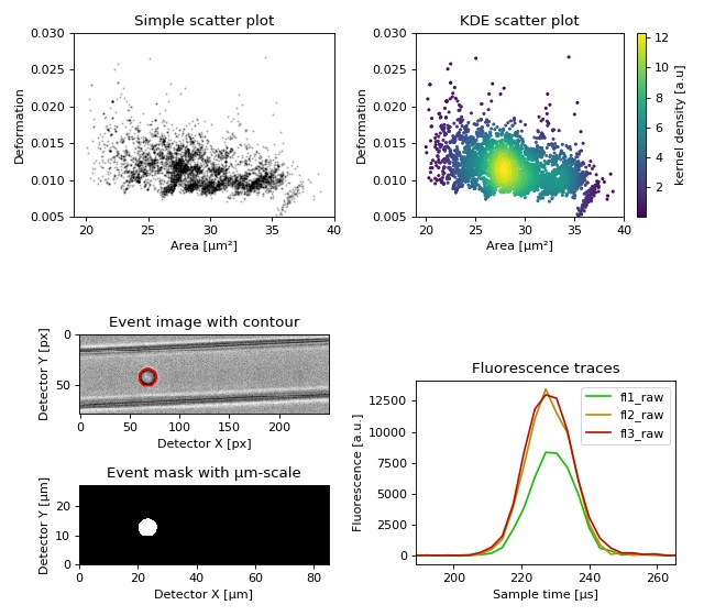
Dataset overview plot
This example demonstrates basic data visualization with dclab and matplotlib. To run this script, download the reference dataset calibration_beads.rtdc [RHMG19] and place it in the same directory.
You will find more examples in the advanced usage section of this documentation.
1 2 3 4 5 6 7 8 9 10 11 12 13 14 15 16 17 18 19 20 21 22 23 24 25 26 27 28 29 30 31 32 33 34 35 36 37 38 39 40 41 42 43 44 45 46 47 48 49 50 51 52 53 54 55 56 57 58 59 60 61 62 63 64 65 66 67 68 69 70 71 72 73 74 75 76 77 | import matplotlib.pylab as plt
import numpy as np
import dclab
# Dataset to display
DATASET_PATH = "calibration_beads.rtdc"
# Features for scatter plot
SCATTER_X = "area_um"
SCATTER_Y = "deform"
# Event index to display
EVENT_INDEX = 100
xlabel = dclab.dfn.get_feature_label(SCATTER_X)
ylabel = dclab.dfn.get_feature_label(SCATTER_Y)
ds = dclab.new_dataset(DATASET_PATH)
fig = plt.figure(figsize=(8, 7))
ax1 = plt.subplot(221, title="Simple scatter plot")
ax1.plot(ds[SCATTER_X], ds[SCATTER_Y], "o", color="k", alpha=.2, ms=1)
ax1.set_xlabel(xlabel)
ax1.set_ylabel(ylabel)
ax1.set_xlim(19, 40)
ax1.set_ylim(0.005, 0.03)
ax2 = plt.subplot(222, title="KDE scatter plot")
sc = ax2.scatter(ds[SCATTER_X], ds[SCATTER_Y],
c=ds.get_kde_scatter(xax=SCATTER_X,
yax=SCATTER_Y,
kde_type="multivariate"),
s=3)
plt.colorbar(sc, label="kernel density [a.u]", ax=ax2)
ax2.set_xlabel(xlabel)
ax2.set_ylabel(ylabel)
ax2.set_xlim(19, 40)
ax2.set_ylim(0.005, 0.03)
ax3 = plt.subplot(425, title="Event image with contour")
ax3.imshow(ds["image"][EVENT_INDEX], cmap="gray")
ax3.plot(ds["contour"][EVENT_INDEX][:, 0],
ds["contour"][EVENT_INDEX][:, 1],
c="r")
ax3.set_xlabel("Detector X [px]")
ax3.set_ylabel("Detector Y [px]")
ax4 = plt.subplot(427, title="Event mask with µm-scale")
pxsize = ds.config["imaging"]["pixel size"]
ax4.imshow(ds["mask"][EVENT_INDEX],
extent=[0, ds["mask"].shape[2] * pxsize,
0, ds["mask"].shape[1] * pxsize],
cmap="gray")
ax4.set_xlabel("Detector X [µm]")
ax4.set_ylabel("Detector Y [µm]")
ax5 = plt.subplot(224, title="Fluorescence traces")
flsamples = ds.config["fluorescence"]["samples per event"]
flrate = ds.config["fluorescence"]["sample rate"]
fltime = np.arange(flsamples) / flrate * 1e6
# here we plot "fl?_raw"; you may also plot "fl?_med"
ax5.plot(fltime, ds["trace"]["fl1_raw"][EVENT_INDEX],
c="#15BF00", label="fl1_raw")
ax5.plot(fltime, ds["trace"]["fl2_raw"][EVENT_INDEX],
c="#BF8A00", label="fl2_raw")
ax5.plot(fltime, ds["trace"]["fl3_raw"][EVENT_INDEX],
c="#BF0C00", label="fl3_raw")
ax5.legend()
ax5.set_xlim(ds["fl1_pos"][EVENT_INDEX] - 2*ds["fl1_width"][EVENT_INDEX],
ds["fl1_pos"][EVENT_INDEX] + 2*ds["fl1_width"][EVENT_INDEX])
ax5.set_xlabel("Event time [µs]")
ax5.set_ylabel("Fluorescence [a.u.]")
plt.tight_layout()
plt.show()
|
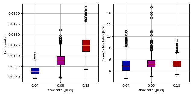
Young’s modulus computation from data on DCOR
This example reproduces the lower right subplot of figure 10 in [Her17]. It illustrates how the Young’s modulus of elastic beads can be retrieved correctly (independent of the flow rate, with correction for pixelation and shear-thinning) using the area-deformation look-up table implemented in dclab (right plot). For comparison, the flow-rate-dependent deformation is also shown (left plot).
The dataset is loaded directly from DCOR and thus an active internet connection is required for this example.
1 2 3 4 5 6 7 8 9 10 11 12 13 14 15 16 17 18 19 20 21 22 23 24 25 26 27 28 29 30 31 32 33 34 35 36 37 38 39 40 41 42 43 44 45 46 47 48 49 50 51 52 53 54 55 56 57 58 59 60 61 62 63 64 65 66 67 68 69 70 71 72 73 74 75 76 77 78 79 80 81 | import dclab
import matplotlib.pylab as plt
# The dataset is also available on figshare
# (https://doi.org/10.6084/m9.figshare.12721436.v1), but we
# are accessing it through the DCOR API, because we do not
# have the time to download the entire dataset. The dataset
# name is figshare-12721436-v1. These are the resource IDs:
ds_loc = ["e4d59480-fa5b-c34e-0001-46a944afc8ea",
"2cea205f-2d9d-26d0-b44c-0a11d5379152",
"2cd67437-a145-82b3-d420-45390f977a90",
]
ds_list = [] # list of opened datasets
labels = [] # list of flow rate labels
# load the data
for loc in ds_loc:
ds = dclab.new_dataset(loc)
labels.append("{:.2f}".format(ds.config["setup"]["flow rate"]))
# emodulus computation
ds.config["calculation"]["emodulus medium"] = ds.config["setup"]["medium"]
ds.config["calculation"]["emodulus model"] = "elastic sphere"
ds.config["calculation"]["emodulus temperature"] = \
ds.config["setup"]["temperature"]
# filtering
ds.config["filtering"]["area_ratio min"] = 1.0
ds.config["filtering"]["area_ratio max"] = 1.1
ds.config["filtering"]["deform min"] = 0
ds.config["filtering"]["deform max"] = 0.035
# This option will remove "nan" events that appear in the "emodulus"
# feature. If you are not working with DCOR, this might lead to a
# longer computation time, because all available features are
# computed locally. For data on DCOR, this computation already has
# been done.
ds.config["filtering"]["remove invalid events"] = True
ds.apply_filter()
# Create a hierarchy child for convenience reasons
# (Otherwise we would have to do e.g. ds["deform"][ds.filter.all]
# everytime we need to access a feature)
ds_list.append(dclab.new_dataset(ds))
# plot
fig = plt.figure(figsize=(8, 4))
# box plot for deformation
ax1 = plt.subplot(121)
ax1.set_ylabel(dclab.dfn.get_feature_label("deform"))
data_deform = [di["deform"] for di in ds_list]
# Uncomment this line if you are not filtering invalid events (above)
# data_deform = [d[~np.isnan(d)] for d in data_deform]
bplot1 = ax1.boxplot(data_deform,
vert=True,
patch_artist=True,
labels=labels,
)
# box plot for Young's modulus
ax2 = plt.subplot(122)
ax2.set_ylabel(dclab.dfn.get_feature_label("emodulus"))
data_emodulus = [di["emodulus"] for di in ds_list]
# Uncomment this line if you are not filtering invalid events (above)
# data_emodulus = [d[~np.isnan(d)] for d in data_emodulus]
bplot2 = ax2.boxplot(data_emodulus,
vert=True,
patch_artist=True,
labels=labels,
)
# colors
colors = ["#0008A5", "#A5008D", "#A50100"]
for bplot in (bplot1, bplot2):
for patch, color in zip(bplot['boxes'], colors):
patch.set_facecolor(color)
# axes
for ax in [ax1, ax2]:
ax.grid()
ax.set_xlabel("flow rate [µL/s]")
plt.tight_layout()
plt.show()
|
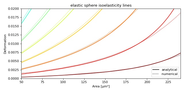
Plotting isoelastics
This example illustrates how to plot dclab isoelastics by reproducing figure 3 (lower left) of [MMM+17].
1 2 3 4 5 6 7 8 9 10 11 12 13 14 15 16 17 18 19 20 21 22 23 24 25 26 27 28 29 30 31 32 33 34 35 36 37 38 | import matplotlib.pylab as plt
import matplotlib.lines as mlines
from matplotlib import cm
import numpy as np
import dclab
# parameters for isoelastics
kwargs = {"col1": "area_um", # x-axis
"col2": "deform", # y-axis
"channel_width": 20, # [um]
"flow_rate": 0.04, # [ul/s]
"viscosity": 15, # [mPa s]
"add_px_err": False # no pixelation error
}
isos = dclab.isoelastics.get_default()
analy = isos.get(method="analytical", **kwargs)
numer = isos.get(method="numerical", **kwargs)
plt.figure(figsize=(8, 4))
ax = plt.subplot(111, title="elastic sphere isoelasticity lines")
colors = [cm.get_cmap("jet")(x) for x in np.linspace(0, 1, len(analy))]
for aa, nn, cc in zip(analy, numer, colors):
ax.plot(aa[:, 0], aa[:, 1], color=cc)
ax.plot(nn[:, 0], nn[:, 1], color=cc, ls=":")
line = mlines.Line2D([], [], color='k', label='analytical')
dotted = mlines.Line2D([], [], color='k', ls=":", label='numerical')
ax.legend(handles=[line, dotted])
ax.set_xlim(50, 240)
ax.set_ylim(0, 0.02)
ax.set_xlabel(dclab.dfn.get_feature_label("area_um"))
ax.set_ylabel(dclab.dfn.get_feature_label("deform"))
plt.tight_layout()
plt.show()
|