Examples
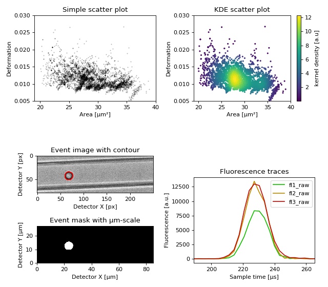
Dataset overview plot
This example demonstrates basic data visualization with dclab and matplotlib. To run this script, download the reference dataset calibration_beads.rtdc [RHMG19] and place it in the same directory.
You will find more examples in the advanced usage section of this documentation.
1 2 3 4 5 6 7 8 9 10 11 12 13 14 15 16 17 18 19 20 21 22 23 24 25 26 27 28 29 30 31 32 33 34 35 36 37 38 39 40 41 42 43 44 45 46 47 48 49 50 51 52 53 54 55 56 57 58 59 60 61 62 63 64 65 66 67 68 69 70 71 72 73 74 75 76 77 | import matplotlib.pylab as plt
import numpy as np
import dclab
# Dataset to display
DATASET_PATH = "calibration_beads.rtdc"
# Features for scatter plot
SCATTER_X = "area_um"
SCATTER_Y = "deform"
# Event index to display
EVENT_INDEX = 100
xlabel = dclab.dfn.get_feature_label(SCATTER_X)
ylabel = dclab.dfn.get_feature_label(SCATTER_Y)
ds = dclab.new_dataset(DATASET_PATH)
fig = plt.figure(figsize=(8, 7))
ax1 = plt.subplot(221, title="Simple scatter plot")
ax1.plot(ds[SCATTER_X], ds[SCATTER_Y], "o", color="k", alpha=.2, ms=1)
ax1.set_xlabel(xlabel)
ax1.set_ylabel(ylabel)
ax1.set_xlim(19, 40)
ax1.set_ylim(0.005, 0.03)
ax2 = plt.subplot(222, title="KDE scatter plot")
sc = ax2.scatter(ds[SCATTER_X], ds[SCATTER_Y],
c=ds.get_kde_scatter(xax=SCATTER_X,
yax=SCATTER_Y,
kde_type="multivariate"),
s=3)
plt.colorbar(sc, label="kernel density [a.u]", ax=ax2)
ax2.set_xlabel(xlabel)
ax2.set_ylabel(ylabel)
ax2.set_xlim(19, 40)
ax2.set_ylim(0.005, 0.03)
ax3 = plt.subplot(425, title="Event image with contour")
ax3.imshow(ds["image"][EVENT_INDEX], cmap="gray")
ax3.plot(ds["contour"][EVENT_INDEX][:, 0],
ds["contour"][EVENT_INDEX][:, 1],
c="r")
ax3.set_xlabel("Detector X [px]")
ax3.set_ylabel("Detector Y [px]")
ax4 = plt.subplot(427, title="Event mask with µm-scale")
pxsize = ds.config["imaging"]["pixel size"]
ax4.imshow(ds["mask"][EVENT_INDEX],
extent=[0, ds["mask"].shape[2] * pxsize,
0, ds["mask"].shape[1] * pxsize],
cmap="gray")
ax4.set_xlabel("Detector X [µm]")
ax4.set_ylabel("Detector Y [µm]")
ax5 = plt.subplot(224, title="Fluorescence traces")
flsamples = ds.config["fluorescence"]["samples per event"]
flrate = ds.config["fluorescence"]["sample rate"]
fltime = np.arange(flsamples) / flrate * 1e6
# here we plot "fl?_raw"; you may also plot "fl?_med"
ax5.plot(fltime, ds["trace"]["fl1_raw"][EVENT_INDEX],
c="#15BF00", label="fl1_raw")
ax5.plot(fltime, ds["trace"]["fl2_raw"][EVENT_INDEX],
c="#BF8A00", label="fl2_raw")
ax5.plot(fltime, ds["trace"]["fl3_raw"][EVENT_INDEX],
c="#BF0C00", label="fl3_raw")
ax5.legend()
ax5.set_xlim(ds["fl1_pos"][EVENT_INDEX] - 2*ds["fl1_width"][EVENT_INDEX],
ds["fl1_pos"][EVENT_INDEX] + 2*ds["fl1_width"][EVENT_INDEX])
ax5.set_xlabel("Event time [µs]")
ax5.set_ylabel("Fluorescence [a.u.]")
plt.tight_layout()
plt.show()
|
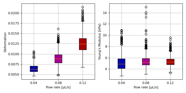
Young’s modulus computation from data on DCOR
This example reproduces the lower right subplot of figure 10 in [Her17]. It illustrates how the Young’s modulus of elastic beads can be retrieved correctly (independent of the flow rate, with correction for pixelation and shear-thinning) using the area-deformation look-up table implemented in dclab (right plot). For comparison, the flow-rate-dependent deformation is also shown (left plot).
The dataset is loaded directly from DCOR and thus an active internet connection is required for this example.
1 2 3 4 5 6 7 8 9 10 11 12 13 14 15 16 17 18 19 20 21 22 23 24 25 26 27 28 29 30 31 32 33 34 35 36 37 38 39 40 41 42 43 44 45 46 47 48 49 50 51 52 53 54 55 56 57 58 59 60 61 62 63 64 65 66 67 68 69 70 71 72 73 74 75 76 77 78 79 80 81 | import dclab
import matplotlib.pylab as plt
# The dataset is also available on figshare
# (https://doi.org/10.6084/m9.figshare.12721436.v1), but we
# are accessing it through the DCOR API, because we do not
# have the time to download the entire dataset. The dataset
# name is figshare-12721436-v1. These are the resource IDs:
ds_loc = ["e4d59480-fa5b-c34e-0001-46a944afc8ea",
"2cea205f-2d9d-26d0-b44c-0a11d5379152",
"2cd67437-a145-82b3-d420-45390f977a90",
]
ds_list = [] # list of opened datasets
labels = [] # list of flow rate labels
# load the data
for loc in ds_loc:
ds = dclab.new_dataset(loc)
labels.append("{:.2f}".format(ds.config["setup"]["flow rate"]))
# emodulus computation
ds.config["calculation"]["emodulus lut"] = "LE-2D-FEM-19"
ds.config["calculation"]["emodulus medium"] = ds.config["setup"]["medium"]
ds.config["calculation"]["emodulus temperature"] = \
ds.config["setup"]["temperature"]
# filtering
ds.config["filtering"]["area_ratio min"] = 1.0
ds.config["filtering"]["area_ratio max"] = 1.1
ds.config["filtering"]["deform min"] = 0
ds.config["filtering"]["deform max"] = 0.035
# This option will remove "nan" events that appear in the "emodulus"
# feature. If you are not working with DCOR, this might lead to a
# longer computation time, because all available features are
# computed locally. For data on DCOR, this computation already has
# been done.
ds.config["filtering"]["remove invalid events"] = True
ds.apply_filter()
# Create a hierarchy child for convenience reasons
# (Otherwise we would have to do e.g. ds["deform"][ds.filter.all]
# everytime we need to access a feature)
ds_list.append(dclab.new_dataset(ds))
# plot
fig = plt.figure(figsize=(8, 4))
# box plot for deformation
ax1 = plt.subplot(121)
ax1.set_ylabel(dclab.dfn.get_feature_label("deform"))
data_deform = [di["deform"] for di in ds_list]
# Uncomment this line if you are not filtering invalid events (above)
# data_deform = [d[~np.isnan(d)] for d in data_deform]
bplot1 = ax1.boxplot(data_deform,
vert=True,
patch_artist=True,
labels=labels,
)
# box plot for Young's modulus
ax2 = plt.subplot(122)
ax2.set_ylabel(dclab.dfn.get_feature_label("emodulus"))
data_emodulus = [di["emodulus"] for di in ds_list]
# Uncomment this line if you are not filtering invalid events (above)
# data_emodulus = [d[~np.isnan(d)] for d in data_emodulus]
bplot2 = ax2.boxplot(data_emodulus,
vert=True,
patch_artist=True,
labels=labels,
)
# colors
colors = ["#0008A5", "#A5008D", "#A50100"]
for bplot in (bplot1, bplot2):
for patch, color in zip(bplot['boxes'], colors):
patch.set_facecolor(color)
# axes
for ax in [ax1, ax2]:
ax.grid()
ax.set_xlabel("flow rate [µL/s]")
plt.tight_layout()
plt.show()
|
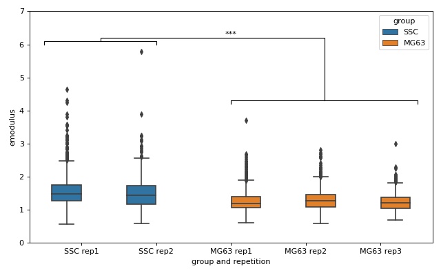
lme4: Linear mixed-effects models
We would like to quantify the difference between human skeletal stem cells (SSC) and the human osteosarcoma cell line MG-63 (which is often used as a model system for SSCs) using a likelihood ratio test based on LMM.
This example illustrates a basic LMM analysis. The data are loaded from DCOR ([XRM+20], DCOR:figshare-11662773-v2). We treat SSC as our “treatment” and MG-63 as our “control” group. These are just names that remind us that we are comparing one type of sample against another type.
We are interested in the p-value, which is 0.01256 for deformation. We repeat the analysis with area (0.0002183) and Young’s modulus (0.0002771). The p-values indicate that MG-63 (mean elastic modulus 1.26 kPa) cells are softer than SSCs (mean elastic modulus 1.54 kPa). The figure reproduces the last subplot of figure 6b im [HMMO18].
1 2 3 4 5 6 7 8 9 10 11 12 13 14 15 16 17 18 19 20 21 22 23 24 25 26 27 28 29 30 31 32 33 34 35 36 37 38 39 40 41 42 43 44 45 46 47 48 49 50 51 52 53 54 55 56 57 58 59 60 61 62 63 64 65 66 67 68 69 70 71 72 73 74 75 76 77 78 79 80 81 82 83 84 85 86 | import dclab
from dclab import lme4
import pandas as pd
import seaborn as sns
import matplotlib.pyplot as plt
# https://dcor.mpl.mpg.de/dataset/figshare-11662773-v2
# SSC_16uls_rep1_20150611.rtdc
ds_ssc_rep1 = dclab.new_dataset("86cc5a47-364b-cf58-f9e3-cc114dd38e55")
# SSC_16uls_rep2_20150611.rtdc
ds_ssc_rep2 = dclab.new_dataset("ab95c914-0311-6a46-4eba-8fabca7d27d6")
# MG63_pure_16uls_rep1_20150421.rtdc
ds_mg63_rep1 = dclab.new_dataset("42cb33d4-2f7c-3c22-88e1-b9102d64d7e9")
# MG63_pure_16uls_rep2_20150422.rtdc
ds_mg63_rep2 = dclab.new_dataset("a4a98fcb-1de1-1048-0efc-b0a84d4ab32e")
# MG63_pure_16uls_rep3_20150422.rtdc
ds_mg63_rep3 = dclab.new_dataset("0a8096ce-ea7a-e36d-1df3-42c7885cd71c")
datasets = [ds_ssc_rep1, ds_ssc_rep2, ds_mg63_rep1, ds_mg63_rep2, ds_mg63_rep3]
for ds in datasets:
# perform filtering
ds.config["filtering"]["area_ratio min"] = 0
ds.config["filtering"]["area_ratio max"] = 1.05
ds.config["filtering"]["area_um min"] = 120
ds.config["filtering"]["area_um max"] = 550
ds.config["filtering"]["deform min"] = 0
ds.config["filtering"]["deform max"] = 0.1
ds.apply_filter()
# enable computation of Young's modulus
ds.config["calculation"]["emodulus lut"] = "LE-2D-FEM-19"
ds.config["calculation"]["emodulus medium"] = "CellCarrier"
ds.config["calculation"]["emodulus temperature"] = 23.0
# setup lme4 analysis
rlme4 = lme4.Rlme4(model="lmer")
rlme4.add_dataset(ds_ssc_rep1, group="treatment", repetition=1)
rlme4.add_dataset(ds_ssc_rep2, group="treatment", repetition=2)
rlme4.add_dataset(ds_mg63_rep1, group="control", repetition=1)
rlme4.add_dataset(ds_mg63_rep2, group="control", repetition=2)
rlme4.add_dataset(ds_mg63_rep3, group="control", repetition=3)
# perform analysis for deformation
for feat in ["area_um", "deform", "emodulus"]:
res = rlme4.fit(feature=feat)
print("Results for {}:".format(feat))
print(" p-value", res["anova p-value"])
print(" mean of MG-63", res["fixed effects intercept"])
print(" fixed effect size", res["fixed effects treatment"])
# prepare for plotting
df = pd.DataFrame()
for ds in datasets:
group = ds.config["experiment"]["sample"].split()[0]
rep = ds.config["experiment"]["sample"].split()[-1]
dfi = pd.DataFrame.from_dict(
{"area_m": ds["area_um"][ds.filter.all],
"deform": ds["deform"][ds.filter.all],
"emodulus": ds["emodulus"][ds.filter.all],
"group and repetition": [group + " " + rep] * ds.filter.all.sum(),
"group": [group] * ds.filter.all.sum(),
})
df = df.append(dfi)
# plot
fig = plt.figure(figsize=(8, 5))
ax = sns.boxplot(x="group and repetition", y="emodulus", data=df, hue="group")
# note that `res` is still the result for "emodulus"
numstars = sum([res["anova p-value"] < .05,
res["anova p-value"] < .01,
res["anova p-value"] < .001,
res["anova p-value"] < .0001])
# significance bars
h = .1
y1 = 6
y2 = 4.2
y3 = 6.2
ax.plot([-.5, -.5, 1, 1], [y1, y1+h, y1+h, y1], lw=1, c="k")
ax.plot([2, 2, 4.5, 4.5], [y2, y2+h, y2+h, y2], lw=1, c="k")
ax.plot([.25, .25, 3.25, 3.25], [y1+h, y1+2*h, y1+2*h, y2+h], lw=1, c="k")
ax.text(2, y3, "*"*numstars, ha='center', va='bottom', color="k")
ax.set_ylim(0, 7)
plt.tight_layout()
plt.show()
|
lme4: Generalized linear mixed-effects models with differential deformation
This example illustrates how to perform a differential feature (including reservoir data) GLMM analysis. The example data are taken from DCOR ([XRM+20], DCOR:figshare-11662773-v2). As in the previous example, we treat SSC as our “treatment” and MG-63 as our “control” group.
The p-value for the differential deformation is magnitudes lower than the p-value for the (non-differential) deformation in the previous example. This indicates that there is a non-negligible initial deformation of the cells in the reservoir.
1 2 3 4 5 6 7 8 9 10 11 12 13 14 15 16 17 18 19 20 21 22 23 24 25 26 27 28 29 30 31 32 33 34 35 36 37 38 39 40 41 42 43 | from dclab import lme4, new_dataset
# https://dcor.mpl.mpg.de/dataset/figshare-11662773-v2
datasets = [
# SSC channel
[new_dataset("86cc5a47-364b-cf58-f9e3-cc114dd38e55"), "treatment", 1],
[new_dataset("ab95c914-0311-6a46-4eba-8fabca7d27d6"), "treatment", 2],
# SSC reservoir
[new_dataset("761ab515-0416-ede8-5137-135c1682580c"), "treatment", 1],
[new_dataset("3b83d47b-d860-4558-51d6-dcc524f5f90d"), "treatment", 2],
# MG-63 channel
[new_dataset("42cb33d4-2f7c-3c22-88e1-b9102d64d7e9"), "control", 1],
[new_dataset("a4a98fcb-1de1-1048-0efc-b0a84d4ab32e"), "control", 2],
[new_dataset("0a8096ce-ea7a-e36d-1df3-42c7885cd71c"), "control", 3],
# MG-63 reservoir
[new_dataset("56c449bb-b6c9-6df7-6f70-6744b9960980"), "control", 1],
[new_dataset("387b5ac9-1cc6-6cac-83d1-98df7d687d2f"), "control", 2],
[new_dataset("7ae49cd7-10d7-ef35-a704-72443bb32da7"), "control", 3],
]
# perform filtering
for ds, _, _ in datasets:
ds.config["filtering"]["area_ratio min"] = 0
ds.config["filtering"]["area_ratio max"] = 1.05
ds.config["filtering"]["area_um min"] = 120
ds.config["filtering"]["area_um max"] = 550
ds.config["filtering"]["deform min"] = 0
ds.config["filtering"]["deform max"] = 0.1
ds.apply_filter()
# perform LMM analysis for differential deformation
# setup lme4 analysis
rlme4 = lme4.Rlme4(feature="deform")
for ds, group, repetition in datasets:
rlme4.add_dataset(ds, group=group, repetition=repetition)
# LMM
lmer_result = rlme4.fit(model="lmer")
print("LMM p-value", lmer_result["anova p-value"]) # 0.00000351
# GLMM with log link function
glmer_result = rlme4.fit(model="glmer+loglink")
print("GLMM p-value", glmer_result["anova p-value"]) # 0.000868
|
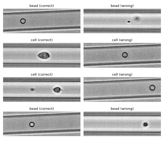
ML: Using RT-DC data with tensorflow
We use tensorflow to distinguish between beads and cells using
scalar features only. The example data is taken from a reference
dataset on DCOR.
The classification accuracy using only the inputs area_ratio,
area_um, bright_sd, and deform reaches values above 95%.
Warning
This example neglects a lot of important aspects of machine learning with RT-DC data (e.g. brightness normalization) and it is a very easy task (beads are smaller than cells). Thus, this example should only be considered as a technical guide on how tensorflow can be used with RT-DC data.
Note
What happens when you add "bright_avg" to the features list?
Can you explain the result?
Apparently, debris in the cell dataset is classified as beads. We could have gotten around that by filtering the input data before inference. In addition, some beads get classified as cells as well. This is a result of the limited features used for training/inference. Under normal cirumstances, you would investigate other features in order to improve the model prediction.
1 2 3 4 5 6 7 8 9 10 11 12 13 14 15 16 17 18 19 20 21 22 23 24 25 26 27 28 29 30 31 32 33 34 35 36 37 38 39 40 41 42 43 44 45 46 47 48 49 50 51 52 53 54 55 56 57 58 59 60 61 62 63 64 65 66 67 68 69 70 71 72 73 74 75 76 77 78 | import matplotlib.pylab as plt
import numpy as np
import tensorflow as tf
from dclab.ml import tf_dataset
tf.random.set_seed(42) # for reproducibility
# https://dcor.mpl.mpg.de/dataset/figshare-7771184-v2
dcor_ids = ["fb719fb2-bd9f-817a-7d70-f4002af916f0",
"f7fa778f-6abd-1b53-ae5f-9ce12601d6f8"]
labels = [0, 1] # 0: beads, 1: cells
features = ["area_ratio", "area_um", "bright_sd", "deform"]
# obtain train and test datasets
train, test = tf_dataset.assemble_tf_dataset_scalars(
dc_data=dcor_ids, # can also be list of paths or datasets
labels=labels,
feature_inputs=features,
split=.8)
# build the model
model = tf.keras.Sequential(
layers=[
tf.keras.layers.Input(shape=(len(features),)),
tf.keras.layers.Dense(128, activation='relu'),
tf.keras.layers.Dense(32),
tf.keras.layers.Dropout(0.2),
tf.keras.layers.Dense(2)
],
name="scalar_features"
)
# fit the model to the training data
loss_fn = tf.keras.losses.SparseCategoricalCrossentropy(from_logits=True)
model.compile(optimizer='adam', loss=loss_fn, metrics=['accuracy'])
model.fit(train, epochs=5)
# show accuracy using test data (loss: 0.1139 - accuracy: 0.9659)
model.evaluate(test, verbose=2)
# predict classes of the test data
probability_model = tf.keras.Sequential([model, tf.keras.layers.Softmax()])
y_test = np.concatenate([y for x, y in test], axis=0)
predict = np.argmax(probability_model.predict(test), axis=1)
# take a few exemplary events from true and false classification
false_cl = np.where(predict != y_test)[0]
true_cl = np.where(predict == y_test)[0]
num_events = min(4, min(len(true_cl), len(false_cl)))
false_images = tf_dataset.get_dataset_event_feature(
dc_data=dcor_ids,
feature="image",
tf_dataset_indices=false_cl[:num_events],
split_index=1,
split=.8)
true_images = tf_dataset.get_dataset_event_feature(
dc_data=dcor_ids,
feature="image",
tf_dataset_indices=true_cl[:num_events],
split_index=1,
split=.8)
fig = plt.figure(figsize=(8, 7))
for ii in range(num_events):
title_true = ("cell" if y_test[true_cl[[ii]]] else "bead") + " (correct)"
title_false = ("cell" if predict[false_cl[ii]] else "bead") + " (wrong)"
ax1 = plt.subplot(num_events, 2, 2*ii+1, title=title_true)
ax2 = plt.subplot(num_events, 2, 2*(ii + 1), title=title_false)
ax1.axis("off")
ax2.axis("off")
ax1.imshow(true_images[ii], cmap="gray")
ax2.imshow(false_images[ii], cmap="gray")
plt.tight_layout()
plt.show()
|
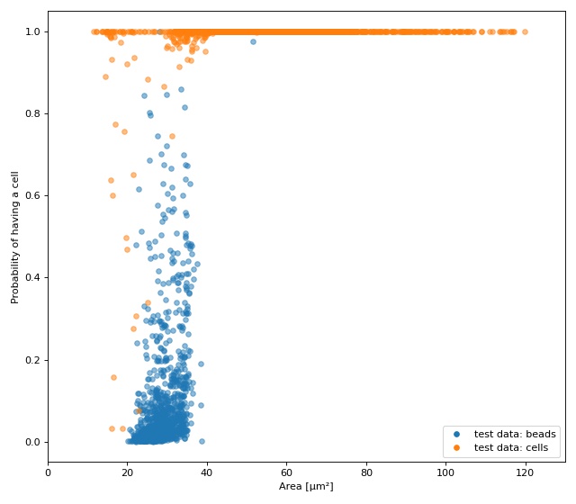
ML: Creating built-in models for dclab
The tensorflow example already showcased a few convenience functions for machine learning implemented in dclab. In this example, we want to go even further and transform the predictions of an ML model into an ancillary feature (which is then globally available in dclab).
A few things are different from the other example:
We rename
modeltobare_modelto make a clear distinction between the actual ML model (from tensorflow) and the model wrapper (see Using models in dclab).We turn the two-class problem into a regression problem for one feature only. Consequently, the loss function changes to “binary crossentropy” and for some inexplicable reason we have to train for 20 epochs instead of the previously 5 to achieve convergence in accuracy.
Finally, and this is the whole point of this example, we register the model as an ancillary feature and perform inference indirectly by simply accessing the
ml_score_celfeature of the test dataset.
The plot shows the test fraction of the dataset. The x-axis is
(arbitrarily) set to area. The y-axis shows the sigmoid (dclab
automatically applies a sigmoid activation if it is not present
in the final layer; see dclab.ml.models.TensorflowModel.predict())
of the model’s output logits.
1 2 3 4 5 6 7 8 9 10 11 12 13 14 15 16 17 18 19 20 21 22 23 24 25 26 27 28 29 30 31 32 33 34 35 36 37 38 39 40 41 42 43 44 45 46 47 48 49 50 51 52 53 54 55 56 57 58 59 60 61 62 63 64 65 66 67 68 69 70 71 72 73 74 75 76 77 78 79 80 81 82 83 84 85 86 87 88 89 90 91 92 93 94 95 | import matplotlib.pylab as plt
import numpy as np
import tensorflow as tf
import dclab.ml
tf.random.set_seed(42) # for reproducibility
# https://dcor.mpl.mpg.de/dataset/figshare-7771184-v2
dcor_ids = ["fb719fb2-bd9f-817a-7d70-f4002af916f0",
"f7fa778f-6abd-1b53-ae5f-9ce12601d6f8"]
labels = [0, 1] # 0: beads, 1: cells
features = ["area_ratio", "area_um", "bright_sd", "deform"]
tf_kw = {"dc_data": dcor_ids,
"split": .8,
"shuffle": True,
}
# obtain train and test datasets
train, test = dclab.ml.tf_dataset.assemble_tf_dataset_scalars(
labels=labels, feature_inputs=features, **tf_kw)
# build the model
bare_model = tf.keras.Sequential(
layers=[
tf.keras.layers.Input(shape=(len(features),)),
tf.keras.layers.Dense(128),
tf.keras.layers.Dense(32),
tf.keras.layers.Dropout(0.3),
tf.keras.layers.Dense(1)
],
name="scalar_features"
)
# fit the model to the training data
# Note that we did not add a "sigmoid" activation function to the
# final layer and are training with logits here. We also don't
# have to manually add it in a later step, because dclab will
# add it automatically (if it does not exist) before prediction.
loss_fn = tf.keras.losses.BinaryCrossentropy(from_logits=True)
bare_model.compile(optimizer='adam', loss=loss_fn, metrics=['accuracy'])
bare_model.fit(train, epochs=20)
# show accuracy using test data (loss: 0.0725 - accuracy: 0.9877)
bare_model.evaluate(test, verbose=2)
# register the ancillary feature "ml_score_cel" in dclab
dc_model = dclab.ml.models.TensorflowModel(
bare_model=bare_model,
inputs=features,
outputs=["ml_score_cel"],
output_labels=["Probability of having a cell"],
model_name="Distinguish between cells and beads",
)
dc_model.register()
# Now we are actually done already. The only thing left to do is to
# visualize the prediction for the test-fraction of our dataset.
# This involves a bit of data shuffling (obtaining the dataset indices
# from the "index" feature (which starts at 1 and not 0) and creating
# hierarchy children after applying the corresponding manual filters)
# which is less complicated than it looks.
# create dataset hierarchy children for bead and cell test data
bead_train_indices = dclab.ml.tf_dataset.get_dataset_event_feature(
feature="index", dc_data_indices=[0], split_index=0, **tf_kw)
ds_bead = dclab.new_dataset(dcor_ids[0])
ds_bead.filter.manual[np.array(bead_train_indices) - 1] = False
ds_bead.apply_filter()
ds_bead_test = dclab.new_dataset(ds_bead) # hierarchy child with test fraction
cell_train_indices = dclab.ml.tf_dataset.get_dataset_event_feature(
feature="index", dc_data_indices=[1], split_index=0, **tf_kw)
ds_cell = dclab.new_dataset(dcor_ids[1])
ds_cell.filter.manual[np.array(cell_train_indices) - 1] = False
ds_cell.apply_filter()
ds_cell_test = dclab.new_dataset(ds_cell) # hierarchy child with test fraction
fig = plt.figure(figsize=(8, 7))
ax = plt.subplot(111)
plt.plot(ds_bead_test["area_um"], ds_bead_test["ml_score_cel"], ".",
ms=10, alpha=.5, label="test data: beads")
plt.plot(ds_cell_test["area_um"], ds_cell_test["ml_score_cel"], ".",
ms=10, alpha=.5, label="test data: cells")
leg = plt.legend()
for lh in leg.legendHandles:
lh._legmarker.set_alpha(1)
ax.set_xlabel(dclab.dfn.get_feature_label("area_um"))
ax.set_ylabel(dclab.dfn.get_feature_label("ml_score_cel"))
ax.set_xlim(0, 130)
plt.tight_layout()
plt.show()
|
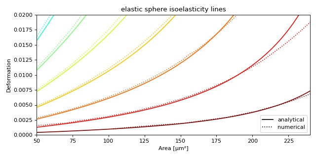
Plotting isoelastics
This example illustrates how to plot dclab isoelastics by reproducing figure 3 (lower left) of [MMM+17].
1 2 3 4 5 6 7 8 9 10 11 12 13 14 15 16 17 18 19 20 21 22 23 24 25 26 27 28 29 30 31 32 33 34 35 36 37 38 | import matplotlib.pylab as plt
import matplotlib.lines as mlines
from matplotlib import cm
import numpy as np
import dclab
# parameters for isoelastics
kwargs = {"col1": "area_um", # x-axis
"col2": "deform", # y-axis
"channel_width": 20, # [um]
"flow_rate": 0.04, # [ul/s]
"viscosity": 15, # [mPa s]
"add_px_err": False # no pixelation error
}
isos = dclab.isoelastics.get_default()
analy = isos.get(lut_identifier="LE-2D-ana-18", **kwargs)
numer = isos.get(lut_identifier="LE-2D-FEM-19", **kwargs)
plt.figure(figsize=(8, 4))
ax = plt.subplot(111, title="elastic sphere isoelasticity lines")
colors = [cm.get_cmap("jet")(x) for x in np.linspace(0, 1, len(analy))]
for aa, nn, cc in zip(analy, numer, colors):
ax.plot(aa[:, 0], aa[:, 1], color=cc)
ax.plot(nn[:, 0], nn[:, 1], color=cc, ls=":")
line = mlines.Line2D([], [], color='k', label='analytical')
dotted = mlines.Line2D([], [], color='k', ls=":", label='numerical')
ax.legend(handles=[line, dotted])
ax.set_xlim(50, 240)
ax.set_ylim(0, 0.02)
ax.set_xlabel(dclab.dfn.get_feature_label("area_um"))
ax.set_ylabel(dclab.dfn.get_feature_label("deform"))
plt.tight_layout()
plt.show()
|