Examples
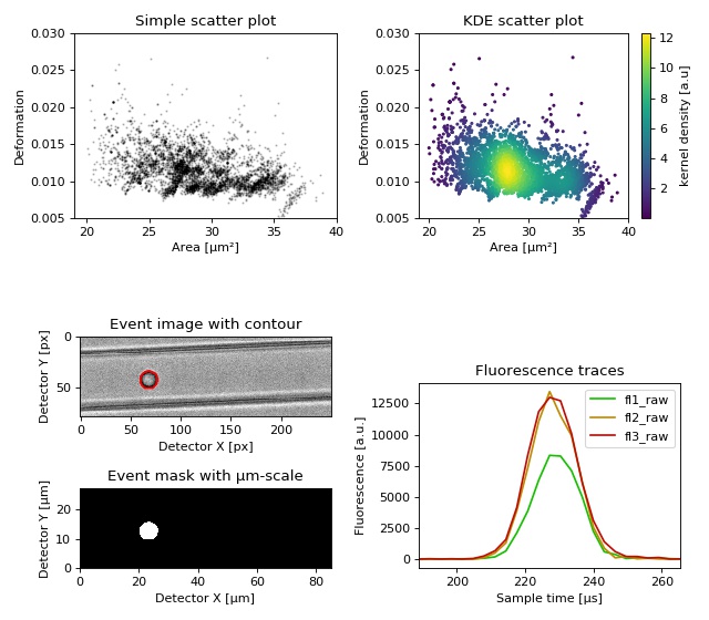
Dataset overview plot
This example demonstrates basic data visualization with dclab and matplotlib. To run this script, download the reference dataset calibration_beads.rtdc [RHMG19] and place it in the same directory.
You will find more examples in the advanced usage section of this documentation.
 1import matplotlib.pylab as plt
 2import numpy as np
 3
 4import dclab
 5
 6# Dataset to display
 7DATASET_PATH = "calibration_beads.rtdc"
 8# Features for scatter plot
 9SCATTER_X = "area_um"
10SCATTER_Y = "deform"
11# Event index to display
12EVENT_INDEX = 100
13
14xlabel = dclab.dfn.get_feature_label(SCATTER_X)
15ylabel = dclab.dfn.get_feature_label(SCATTER_Y)
16
17ds = dclab.new_dataset(DATASET_PATH)
18
19fig = plt.figure(figsize=(8, 7))
20
21
22ax1 = plt.subplot(221, title="Simple scatter plot")
23ax1.plot(ds[SCATTER_X], ds[SCATTER_Y], "o", color="k", alpha=.2, ms=1)
24ax1.set_xlabel(xlabel)
25ax1.set_ylabel(ylabel)
26ax1.set_xlim(19, 40)
27ax1.set_ylim(0.005, 0.03)
28
29ax2 = plt.subplot(222, title="KDE scatter plot")
30sc = ax2.scatter(ds[SCATTER_X], ds[SCATTER_Y],
31                 c=ds.get_kde_scatter(xax=SCATTER_X,
32                                      yax=SCATTER_Y,
33                                      kde_type="multivariate"),
34                 s=3)
35plt.colorbar(sc, label="kernel density [a.u]", ax=ax2)
36ax2.set_xlabel(xlabel)
37ax2.set_ylabel(ylabel)
38ax2.set_xlim(19, 40)
39ax2.set_ylim(0.005, 0.03)
40
41ax3 = plt.subplot(425, title="Event image with contour")
42ax3.imshow(ds["image"][EVENT_INDEX], cmap="gray")
43ax3.plot(ds["contour"][EVENT_INDEX][:, 0],
44         ds["contour"][EVENT_INDEX][:, 1],
45         c="r")
46ax3.set_xlabel("Detector X [px]")
47ax3.set_ylabel("Detector Y [px]")
48
49ax4 = plt.subplot(427, title="Event mask with µm-scale")
50pxsize = ds.config["imaging"]["pixel size"]
51ax4.imshow(ds["mask"][EVENT_INDEX],
52           extent=[0, ds["mask"].shape[2] * pxsize,
53                   0, ds["mask"].shape[1] * pxsize],
54           cmap="gray")
55ax4.set_xlabel("Detector X [µm]")
56ax4.set_ylabel("Detector Y [µm]")
57
58ax5 = plt.subplot(224, title="Fluorescence traces")
59flsamples = ds.config["fluorescence"]["samples per event"]
60flrate = ds.config["fluorescence"]["sample rate"]
61fltime = np.arange(flsamples) / flrate * 1e6
62# here we plot "fl?_raw"; you may also plot "fl?_med"
63ax5.plot(fltime, ds["trace"]["fl1_raw"][EVENT_INDEX],
64         c="#15BF00", label="fl1_raw")
65ax5.plot(fltime, ds["trace"]["fl2_raw"][EVENT_INDEX],
66         c="#BF8A00", label="fl2_raw")
67ax5.plot(fltime, ds["trace"]["fl3_raw"][EVENT_INDEX],
68         c="#BF0C00", label="fl3_raw")
69ax5.legend()
70ax5.set_xlim(ds["fl1_pos"][EVENT_INDEX] - 2*ds["fl1_width"][EVENT_INDEX],
71             ds["fl1_pos"][EVENT_INDEX] + 2*ds["fl1_width"][EVENT_INDEX])
72ax5.set_xlabel("Event time [µs]")
73ax5.set_ylabel("Fluorescence [a.u.]")
74
75plt.tight_layout()
76
77plt.show()
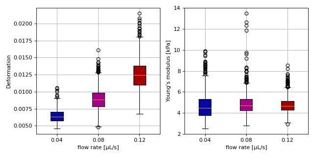
Young’s modulus computation from data on DCOR
This example reproduces the lower right subplot of figure 10 in [Her17]. It illustrates how the Young’s modulus of elastic beads can be retrieved correctly (independent of the flow rate, with correction for pixelation and shear-thinning) using the area-deformation look-up table implemented in dclab (right plot). For comparison, the flow-rate-dependent deformation is also shown (left plot).
Note that this example uses the ‘buyukurganci-2022’ model for computing the viscosity, which was introduced in dclab 0.48.0.
The dataset is loaded directly from DCOR and thus an active internet connection is required for this example.
 1import dclab
 2import matplotlib.pylab as plt
 3
 4# The dataset is also available on figshare
 5# (https://doi.org/10.6084/m9.figshare.12721436.v1), but we
 6# are accessing it through the DCOR API, because we do not
 7# have the time to download the entire dataset. The dataset
 8# name is figshare-12721436-v1. These are the resource IDs:
 9ds_loc = ["e4d59480-fa5b-c34e-0001-46a944afc8ea",
10          "2cea205f-2d9d-26d0-b44c-0a11d5379152",
11          "2cd67437-a145-82b3-d420-45390f977a90",
12          ]
13ds_list = []  # list of opened datasets
14labels = []  # list of flow rate labels
15
16# load the data
17for loc in ds_loc:
18    ds = dclab.new_dataset(loc)
19    labels.append("{:.2f}".format(ds.config["setup"]["flow rate"]))
20    # emodulus computation
21    ds.config["calculation"]["emodulus lut"] = "LE-2D-FEM-19"
22    ds.config["calculation"]["emodulus medium"] = ds.config["setup"]["medium"]
23    ds.config["calculation"]["emodulus temperature"] = \
24        ds.config["setup"]["temperature"]
25    ds.config["calculation"]["emodulus viscosity model"] = 'buyukurganci-2022'
26    # filtering
27    ds.config["filtering"]["area_ratio min"] = 1.0
28    ds.config["filtering"]["area_ratio max"] = 1.1
29    ds.config["filtering"]["deform min"] = 0
30    ds.config["filtering"]["deform max"] = 0.035
31    # This option will remove "nan" events that appear in the "emodulus"
32    # feature. If you are not working with DCOR, this might lead to a
33    # longer computation time, because all available features are
34    # computed locally. For data on DCOR, this computation already has
35    # been done.
36    ds.config["filtering"]["remove invalid events"] = True
37    ds.apply_filter()
38    # Create a hierarchy child for convenience reasons
39    # (Otherwise we would have to do e.g. ds["deform"][ds.filter.all]
40    # everytime we need to access a feature)
41    ds_list.append(dclab.new_dataset(ds))
42
43# plot
44fig = plt.figure(figsize=(8, 4))
45
46# box plot for deformation
47ax1 = plt.subplot(121)
48ax1.set_ylabel(dclab.dfn.get_feature_label("deform"))
49data_deform = [di["deform"] for di in ds_list]
50# Uncomment this line if you are not filtering invalid events (above)
51# data_deform = [d[~np.isnan(d)] for d in data_deform]
52bplot1 = ax1.boxplot(data_deform,
53                     vert=True,
54                     patch_artist=True,
55                     labels=labels,
56                     )
57
58# box plot for Young's modulus
59ax2 = plt.subplot(122)
60ax2.set_ylabel(dclab.dfn.get_feature_label("emodulus"))
61data_emodulus = [di["emodulus"] for di in ds_list]
62# Uncomment this line if you are not filtering invalid events (above)
63# data_emodulus = [d[~np.isnan(d)] for d in data_emodulus]
64bplot2 = ax2.boxplot(data_emodulus,
65                     vert=True,
66                     patch_artist=True,
67                     labels=labels,
68                     )
69
70# colors
71colors = ["#0008A5", "#A5008D", "#A50100"]
72for bplot in (bplot1, bplot2):
73    for patch, color in zip(bplot['boxes'], colors):
74        patch.set_facecolor(color)
75
76# axes
77for ax in [ax1, ax2]:
78    ax.grid()
79    ax.set_xlabel("flow rate [µL/s]")
80
81plt.tight_layout()
82plt.show()
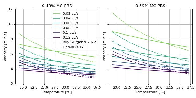
Viscosity models for Young’s modulus estimation
This example visualizes the different viscosity models for the MC-PBS media implemented in dclab. We reproduce the lower left part of figure 3 in [RB23] (channel width is 20 µm).
 1import matplotlib.pylab as plt
 2import matplotlib.lines as mlines
 3from matplotlib import cm
 4import numpy as np
 5
 6from dclab.features.emodulus import viscosity
 7
 8
 9visc_res = {}
10
11for medium in ["0.49% MC-PBS", "0.59% MC-PBS"]:
12    visc_her = {}
13    visc_buy = {}
14
15    kwargs = {
16        "medium": medium,
17        "channel_width": 20.0,
18        "temperature": np.linspace(19, 37, 100, endpoint=True),
19    }
20
21    flow_rate = np.arange(0.02, 0.13, 0.02)
22
23    for fr in flow_rate:
24        visc_her[fr] = viscosity.get_viscosity_mc_pbs_herold_2017(
25            flow_rate=fr, **kwargs)
26        visc_buy[fr] = viscosity.get_viscosity_mc_pbs_buyukurganci_2022(
27            flow_rate=fr, **kwargs)
28
29    visc_res[medium] = [visc_her, visc_buy]
30
31
32fig, axes = plt.subplots(1, 2, figsize=(8, 4), sharey="all", sharex="all")
33colors = [cm.get_cmap("viridis")(x) for x in np.linspace(.8, 0,
34                                                         len(flow_rate))]
35
36for ii, medium in enumerate(visc_res):
37    visc_her, visc_buy = visc_res[medium]
38    ax = axes.flatten()[ii]
39    ax.set_title(medium)
40
41    for jj, fr in enumerate(flow_rate):
42        ax.plot(kwargs["temperature"], visc_her[fr], color=colors[jj], ls="--")
43        ax.plot(kwargs["temperature"], visc_buy[fr], color=colors[jj], ls="-")
44
45    ax.set_xlabel("Temperature [°C]")
46    ax.set_ylabel("Viscosity [mPa·s]")
47    ax.grid()
48    ax.set_ylim(2, 12)
49
50handles = []
51for jj, fr in enumerate(flow_rate):
52    handles.append(
53        mlines.Line2D([], [], color=colors[jj], label=f'{fr:.4g} µL/s'))
54handles.append(
55    mlines.Line2D([], [], color='gray', label='Büyükurgancı 2022'))
56handles.append(
57    mlines.Line2D([], [], color='gray', ls="--", label='Herold 2017'))
58axes[0].legend(handles=handles)
59
60
61plt.tight_layout()
62plt.show()
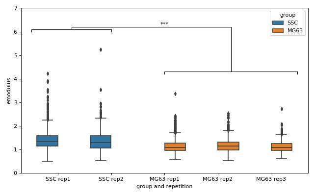
lme4: Linear mixed-effects models
We would like to quantify the difference between human skeletal stem cells (SSC) and the human osteosarcoma cell line MG-63 (which is often used as a model system for SSCs) using a likelihood ratio test based on LMM.
This example illustrates a basic LMM analysis. The data are loaded from DCOR ([XRM+20], DCOR:figshare-11662773-v2). We treat SSC as our “treatment” and MG-63 as our “control” group. These are just names that remind us that we are comparing one type of sample against another type.
We are interested in the p-value, which is 0.01256 for deformation. We repeat the analysis with area (0.0002183) and Young’s modulus (0.0002771). The p-values indicate that MG-63 (mean elastic modulus 1.26 kPa) cells are softer than SSCs (mean elastic modulus 1.54 kPa). The figure reproduces the last subplot of figure 6b im [HMMO18].
 1import dclab
 2from dclab import lme4
 3
 4import pandas as pd
 5import seaborn as sns
 6import matplotlib.pyplot as plt
 7
 8
 9# https://dcor.mpl.mpg.de/dataset/figshare-11662773-v2
10# SSC_16uls_rep1_20150611.rtdc
11ds_ssc_rep1 = dclab.new_dataset("86cc5a47-364b-cf58-f9e3-cc114dd38e55")
12# SSC_16uls_rep2_20150611.rtdc
13ds_ssc_rep2 = dclab.new_dataset("ab95c914-0311-6a46-4eba-8fabca7d27d6")
14# MG63_pure_16uls_rep1_20150421.rtdc
15ds_mg63_rep1 = dclab.new_dataset("42cb33d4-2f7c-3c22-88e1-b9102d64d7e9")
16# MG63_pure_16uls_rep2_20150422.rtdc
17ds_mg63_rep2 = dclab.new_dataset("a4a98fcb-1de1-1048-0efc-b0a84d4ab32e")
18# MG63_pure_16uls_rep3_20150422.rtdc
19ds_mg63_rep3 = dclab.new_dataset("0a8096ce-ea7a-e36d-1df3-42c7885cd71c")
20
21datasets = [ds_ssc_rep1, ds_ssc_rep2, ds_mg63_rep1, ds_mg63_rep2, ds_mg63_rep3]
22for ds in datasets:
23    # perform filtering
24    ds.config["filtering"]["area_ratio min"] = 0
25    ds.config["filtering"]["area_ratio max"] = 1.05
26    ds.config["filtering"]["area_um min"] = 120
27    ds.config["filtering"]["area_um max"] = 550
28    ds.config["filtering"]["deform min"] = 0
29    ds.config["filtering"]["deform max"] = 0.1
30    ds.apply_filter()
31    # enable computation of Young's modulus
32    ds.config["calculation"]["emodulus lut"] = "LE-2D-FEM-19"
33    ds.config["calculation"]["emodulus medium"] = "CellCarrier"
34    ds.config["calculation"]["emodulus temperature"] = 23.0
35    ds.config["calculation"]["emodulus viscosity model"] = 'buyukurganci-2022'
36
37# setup lme4 analysis
38rlme4 = lme4.Rlme4(model="lmer")
39rlme4.add_dataset(ds_ssc_rep1, group="treatment", repetition=1)
40rlme4.add_dataset(ds_ssc_rep2, group="treatment", repetition=2)
41rlme4.add_dataset(ds_mg63_rep1, group="control", repetition=1)
42rlme4.add_dataset(ds_mg63_rep2, group="control", repetition=2)
43rlme4.add_dataset(ds_mg63_rep3, group="control", repetition=3)
44
45# perform analysis for deformation
46for feat in ["area_um", "deform", "emodulus"]:
47    res = rlme4.fit(feature=feat)
48    print("Results for {}:".format(feat))
49    print("  p-value", res["anova p-value"])
50    print("  mean of MG-63", res["fixed effects intercept"])
51    print("  fixed effect size", res["fixed effects treatment"])
52
53# prepare for plotting
54df = pd.DataFrame()
55for ds in datasets:
56    group = ds.config["experiment"]["sample"].split()[0]
57    rep = ds.config["experiment"]["sample"].split()[-1]
58    dfi = pd.DataFrame.from_dict(
59        {"area_m": ds["area_um"][ds.filter.all],
60         "deform": ds["deform"][ds.filter.all],
61         "emodulus": ds["emodulus"][ds.filter.all],
62         "group and repetition": [group + " " + rep] * ds.filter.all.sum(),
63         "group": [group] * ds.filter.all.sum(),
64         })
65    df = df.append(dfi)
66
67# plot
68fig = plt.figure(figsize=(8, 5))
69ax = sns.boxplot(x="group and repetition", y="emodulus", data=df, hue="group")
70# note that `res` is still the result for "emodulus"
71numstars = sum([res["anova p-value"] < .05,
72                res["anova p-value"] < .01,
73                res["anova p-value"] < .001,
74                res["anova p-value"] < .0001])
75# significance bars
76h = .1
77y1 = 6
78y2 = 4.2
79y3 = 6.2
80ax.plot([-.5, -.5, 1, 1], [y1, y1+h, y1+h, y1], lw=1, c="k")
81ax.plot([2, 2, 4.5, 4.5], [y2, y2+h, y2+h, y2], lw=1, c="k")
82ax.plot([.25, .25, 3.25, 3.25], [y1+h, y1+2*h, y1+2*h, y2+h], lw=1, c="k")
83ax.text(2, y3, "*"*numstars, ha='center', va='bottom', color="k")
84ax.set_ylim(0, 7)
85
86plt.tight_layout()
87plt.show()
lme4: Generalized linear mixed-effects models with differential deformation
This example illustrates how to perform a differential feature (including reservoir data) GLMM analysis. The example data are taken from DCOR ([XRM+20], DCOR:figshare-11662773-v2). As in the previous example, we treat SSC as our “treatment” and MG-63 as our “control” group.
The p-value for the differential deformation is magnitudes lower than the p-value for the (non-differential) deformation in the previous example. This indicates that there is a non-negligible initial deformation of the cells in the reservoir.
 1from dclab import lme4, new_dataset
 2
 3# https://dcor.mpl.mpg.de/dataset/figshare-11662773-v2
 4datasets = [
 5    # SSC channel
 6    [new_dataset("86cc5a47-364b-cf58-f9e3-cc114dd38e55"), "treatment", 1],
 7    [new_dataset("ab95c914-0311-6a46-4eba-8fabca7d27d6"), "treatment", 2],
 8    # SSC reservoir
 9    [new_dataset("761ab515-0416-ede8-5137-135c1682580c"), "treatment", 1],
10    [new_dataset("3b83d47b-d860-4558-51d6-dcc524f5f90d"), "treatment", 2],
11    # MG-63 channel
12    [new_dataset("42cb33d4-2f7c-3c22-88e1-b9102d64d7e9"), "control", 1],
13    [new_dataset("a4a98fcb-1de1-1048-0efc-b0a84d4ab32e"), "control", 2],
14    [new_dataset("0a8096ce-ea7a-e36d-1df3-42c7885cd71c"), "control", 3],
15    # MG-63 reservoir
16    [new_dataset("56c449bb-b6c9-6df7-6f70-6744b9960980"), "control", 1],
17    [new_dataset("387b5ac9-1cc6-6cac-83d1-98df7d687d2f"), "control", 2],
18    [new_dataset("7ae49cd7-10d7-ef35-a704-72443bb32da7"), "control", 3],
19]
20
21# perform filtering
22for ds, _, _ in datasets:
23    ds.config["filtering"]["area_ratio min"] = 0
24    ds.config["filtering"]["area_ratio max"] = 1.05
25    ds.config["filtering"]["area_um min"] = 120
26    ds.config["filtering"]["area_um max"] = 550
27    ds.config["filtering"]["deform min"] = 0
28    ds.config["filtering"]["deform max"] = 0.1
29    ds.apply_filter()
30
31# perform LMM analysis for differential deformation
32# setup lme4 analysis
33rlme4 = lme4.Rlme4(feature="deform")
34for ds, group, repetition in datasets:
35    rlme4.add_dataset(ds, group=group, repetition=repetition)
36
37# LMM
38lmer_result = rlme4.fit(model="lmer")
39print("LMM p-value", lmer_result["anova p-value"])  # 0.00000351
40
41# GLMM with log link function
42glmer_result = rlme4.fit(model="glmer+loglink")
43print("GLMM p-value", glmer_result["anova p-value"])  # 0.000868
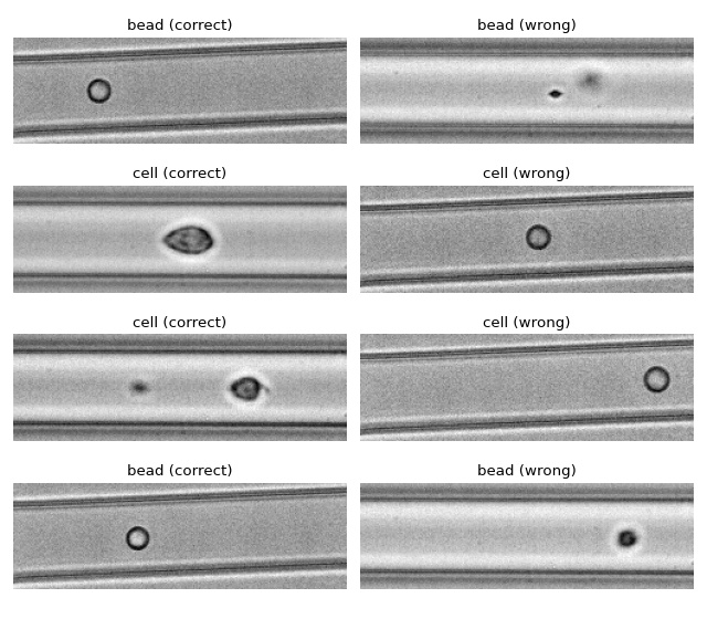
ML: Using RT-DC data with tensorflow
We use tensorflow to distinguish between beads and cells using
scalar features only. The example data is taken from a reference
dataset on DCOR.
The classification accuracy using only the inputs area_ratio,
area_um, bright_sd, and deform reaches values above 95%.
Warning
This example neglects a lot of important aspects of machine learning with RT-DC data (e.g. brightness normalization) and it is a very easy task (beads are smaller than cells). Thus, this example should only be considered as a technical guide on how tensorflow can be used with RT-DC data.
Note
What happens when you add "bright_avg" to the features list?
Can you explain the result?
Apparently, debris in the cell dataset is classified as beads. We could have gotten around that by filtering the input data before inference. In addition, some beads get classified as cells as well. This is a result of the limited features used for training/inference. Under normal cirumstances, you would investigate other features in order to improve the model prediction.
 1import matplotlib.pylab as plt
 2import numpy as np
 3import tensorflow as tf
 4from dclab.rtdc_dataset.feat_anc_ml import hook_tensorflow
 5
 6tf.random.set_seed(42)  # for reproducibility
 7
 8# https://dcor.mpl.mpg.de/dataset/figshare-7771184-v2
 9dcor_ids = ["fb719fb2-bd9f-817a-7d70-f4002af916f0",
10            "f7fa778f-6abd-1b53-ae5f-9ce12601d6f8"]
11labels = [0, 1]  # 0: beads, 1: cells
12features = ["area_ratio", "area_um", "bright_sd", "deform"]
13
14# obtain train and test datasets
15train, test = hook_tensorflow.assemble_tf_dataset_scalars(
16    dc_data=dcor_ids,  # can also be list of paths or datasets
17    labels=labels,
18    feature_inputs=features,
19    split=.8)
20
21# build the model
22model = tf.keras.Sequential(
23    layers=[
24        tf.keras.layers.Input(shape=(len(features),)),
25        tf.keras.layers.Dense(128, activation='relu'),
26        tf.keras.layers.Dense(32),
27        tf.keras.layers.Dropout(0.2),
28        tf.keras.layers.Dense(2)
29    ],
30    name="scalar_features"
31)
32
33# fit the model to the training data
34loss_fn = tf.keras.losses.SparseCategoricalCrossentropy(from_logits=True)
35model.compile(optimizer='adam', loss=loss_fn, metrics=['accuracy'])
36model.fit(train, epochs=5)
37
38# show accuracy using test data (loss: 0.1139 - accuracy: 0.9659)
39model.evaluate(test, verbose=2)
40
41# predict classes of the test data
42probability_model = tf.keras.Sequential([model, tf.keras.layers.Softmax()])
43y_test = np.concatenate([y for x, y in test], axis=0)
44predict = np.argmax(probability_model.predict(test), axis=1)
45
46# take a few exemplary events from true and false classification
47false_cl = np.where(predict != y_test)[0]
48true_cl = np.where(predict == y_test)[0]
49num_events = min(4, min(len(true_cl), len(false_cl)))
50
51false_images = hook_tensorflow.get_dataset_event_feature(
52    dc_data=dcor_ids,
53    feature="image",
54    tf_dataset_indices=false_cl[:num_events],
55    split_index=1,
56    split=.8)
57
58true_images = hook_tensorflow.get_dataset_event_feature(
59    dc_data=dcor_ids,
60    feature="image",
61    tf_dataset_indices=true_cl[:num_events],
62    split_index=1,
63    split=.8)
64
65fig = plt.figure(figsize=(8, 7))
66
67for ii in range(num_events):
68    title_true = ("cell" if y_test[true_cl[[ii]]] else "bead") + " (correct)"
69    title_false = ("cell" if predict[false_cl[ii]] else "bead") + " (wrong)"
70    ax1 = plt.subplot(num_events, 2, 2*ii+1, title=title_true)
71    ax2 = plt.subplot(num_events, 2, 2*(ii + 1), title=title_false)
72    ax1.axis("off")
73    ax2.axis("off")
74    ax1.imshow(true_images[ii], cmap="gray")
75    ax2.imshow(false_images[ii], cmap="gray")
76
77plt.tight_layout()
78plt.show()
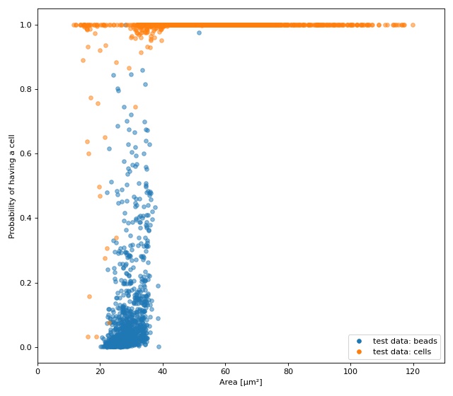
ML: Creating built-in models for dclab with tensorflow
The tensorflow example already showcased a few convenience functions for machine learning implemented in dclab. In this example, we want to go even further and transform the predictions of an ML model into an ancillary feature (which is then globally available in dclab).
A few things are different from the other example:
We rename
modeltobare_modelto make a clear distinction between the actual ML model (from tensorflow) and the model wrapper (see Using models in dclab).We turn the two-class problem into a regression problem for one feature only. Consequently, the loss function changes to “binary crossentropy” and for some inexplicable reason we have to train for 20 epochs instead of the previously 5 to achieve convergence in accuracy.
Finally, and this is the whole point of this example, we register the model as an ancillary feature and perform inference indirectly by simply accessing the
ml_score_celfeature of the test dataset.
The plot shows the test fraction of the dataset. The x-axis is
(arbitrarily) set to area. The y-axis shows the sigmoid (dclab
automatically applies a sigmoid activation if it is not present
in the final layer; see
dclab.rtdc_dataset.feat_anc_ml.hook_tensorflow.TensorflowModel.predict())
of the model’s output logits.
  1import matplotlib.pylab as plt
  2import numpy as np
  3import tensorflow as tf
  4import dclab
  5from dclab.rtdc_dataset.feat_anc_ml import hook_tensorflow
  6
  7
  8tf.random.set_seed(42)  # for reproducibility
  9
 10# https://dcor.mpl.mpg.de/dataset/figshare-7771184-v2
 11dcor_ids = ["fb719fb2-bd9f-817a-7d70-f4002af916f0",
 12            "f7fa778f-6abd-1b53-ae5f-9ce12601d6f8"]
 13labels = [0, 1]  # 0: beads, 1: cells
 14features = ["area_ratio", "area_um", "bright_sd", "deform"]
 15
 16tf_kw = {"dc_data": dcor_ids,
 17         "split": .8,
 18         "shuffle": True,
 19         }
 20
 21# obtain train and test datasets
 22train, test = hook_tensorflow.assemble_tf_dataset_scalars(
 23    labels=labels, feature_inputs=features, **tf_kw)
 24
 25# build the model
 26bare_model = tf.keras.Sequential(
 27    layers=[
 28        tf.keras.layers.Input(shape=(len(features),)),
 29        tf.keras.layers.Dense(128),
 30        tf.keras.layers.Dense(32),
 31        tf.keras.layers.Dropout(0.3),
 32        tf.keras.layers.Dense(1)
 33    ],
 34    name="scalar_features"
 35)
 36
 37# fit the model to the training data
 38# Note that we did not add a "sigmoid" activation function to the
 39# final layer and are training with logits here. We also don't
 40# have to manually add it in a later step, because dclab will
 41# add it automatically (if it does not exist) before prediction.
 42loss_fn = tf.keras.losses.BinaryCrossentropy(from_logits=True)
 43bare_model.compile(optimizer='adam', loss=loss_fn, metrics=['accuracy'])
 44bare_model.fit(train, epochs=20)
 45
 46# show accuracy using test data (loss: 0.0725 - accuracy: 0.9877)
 47bare_model.evaluate(test, verbose=2)
 48
 49# register the ancillary feature "ml_score_cel" in dclab
 50dc_model = hook_tensorflow.TensorflowModel(
 51    bare_model=bare_model,
 52    inputs=features,
 53    outputs=["ml_score_cel"],
 54    info={
 55        "description": "Distinguish between cells and beads",
 56        "output labels": ["Probability of having a cell"],
 57    }
 58)
 59dclab.MachineLearningFeature(feature_name="ml_score_cel",
 60                             dc_model=dc_model)
 61
 62# Now we are actually done already. The only thing left to do is to
 63# visualize the prediction for the test-fraction of our dataset.
 64# This involves a bit of data shuffling (obtaining the dataset indices
 65# from the "index" feature (which starts at 1 and not 0) and creating
 66# hierarchy children after applying the corresponding manual filters)
 67# which is less complicated than it looks.
 68
 69# create dataset hierarchy children for bead and cell test data
 70bead_train_indices = hook_tensorflow.get_dataset_event_feature(
 71    feature="index", dc_data_indices=[0], split_index=0, **tf_kw)
 72ds_bead = dclab.new_dataset(dcor_ids[0])
 73ds_bead.filter.manual[np.array(bead_train_indices) - 1] = False
 74ds_bead.apply_filter()
 75ds_bead_test = dclab.new_dataset(ds_bead)  # hierarchy child with test fraction
 76
 77cell_train_indices = hook_tensorflow.get_dataset_event_feature(
 78    feature="index", dc_data_indices=[1], split_index=0, **tf_kw)
 79ds_cell = dclab.new_dataset(dcor_ids[1])
 80ds_cell.filter.manual[np.array(cell_train_indices) - 1] = False
 81ds_cell.apply_filter()
 82ds_cell_test = dclab.new_dataset(ds_cell)  # hierarchy child with test fraction
 83
 84fig = plt.figure(figsize=(8, 7))
 85ax = plt.subplot(111)
 86
 87plt.plot(ds_bead_test["area_um"], ds_bead_test["ml_score_cel"], ".",
 88         ms=10, alpha=.5, label="test data: beads")
 89plt.plot(ds_cell_test["area_um"], ds_cell_test["ml_score_cel"], ".",
 90         ms=10, alpha=.5, label="test data: cells")
 91leg = plt.legend()
 92for lh in leg.legendHandles:
 93    lh._legmarker.set_alpha(1)
 94
 95ax.set_xlabel(dclab.dfn.get_feature_label("area_um"))
 96ax.set_ylabel(dclab.dfn.get_feature_label("ml_score_cel"))
 97ax.set_xlim(0, 130)
 98
 99plt.tight_layout()
100plt.show()
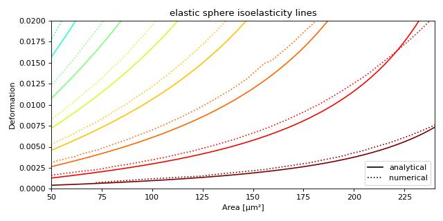
Plotting isoelastics
This example illustrates how to plot dclab isoelastics by reproducing figure 3 (lower left) of [MMM+17].
Warning
This example does not work anymore since dclab 0.46.0, because the isoelasticity lines of the analytical model have different Young’s moduli than the ones of the revised LE-2D-FEM-19 model. For the sake of completeness, we keep this example here. If you would like to extract lines at specific Young’s moduli, please take a look at the next example.
 1import matplotlib.pylab as plt
 2import matplotlib.lines as mlines
 3from matplotlib import cm
 4import numpy as np
 5
 6import dclab
 7
 8# parameters for isoelastics
 9kwargs = {"col1": "area_um",  # x-axis
10          "col2": "deform",  # y-axis
11          "channel_width": 20,  # [um]
12          "flow_rate": 0.04,  # [ul/s]
13          "viscosity": 15,  # [mPa s]
14          "add_px_err": False  # no pixelation error
15          }
16
17isos = dclab.isoelastics.get_default()
18analy = isos.get(lut_identifier="LE-2D-ana-18", **kwargs)
19numer = isos.get(lut_identifier="LE-2D-FEM-19", **kwargs)
20
21plt.figure(figsize=(8, 4))
22ax = plt.subplot(111, title="elastic sphere isoelasticity lines")
23colors = [cm.get_cmap("jet")(x) for x in np.linspace(0, 1, len(analy))]
24for aa, nn, cc in zip(analy, numer, colors):
25    ax.plot(aa[:, 0], aa[:, 1], color=cc)
26    ax.plot(nn[:, 0], nn[:, 1], color=cc, ls=":")
27
28line = mlines.Line2D([], [], color='k', label='analytical')
29dotted = mlines.Line2D([], [], color='k', ls=":", label='numerical')
30ax.legend(handles=[line, dotted])
31
32ax.set_xlim(50, 240)
33ax.set_ylim(0, 0.02)
34ax.set_xlabel(dclab.dfn.get_feature_label("area_um"))
35ax.set_ylabel(dclab.dfn.get_feature_label("deform"))
36
37plt.tight_layout()
38plt.show()
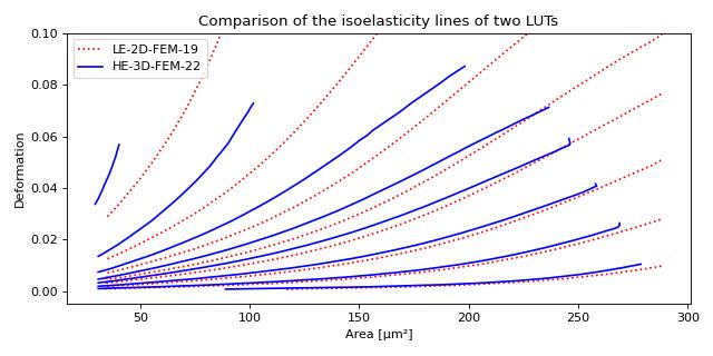
Plotting custom isoelastics
This example illustrates how to extract custom isoelasticity lines from the dclab look-up tables by reproducing figure 3 (right) of [WRM+22].
Note that at the boundary of the support of a look-up table, the isoelasticity lines may break away in perpendicular directions. The underlying reason is that the look-up table is first mapped onto a grid from which the constant isoelasticity lines are extracted. Since the Young’s modulus values are linearly interpolated from the LUT onto that grid, there can be inaccuracies for pixels that are at the LUT boundary.
An elaborate way of getting rid of these inaccuracies (and this is how the isoelasticity lines for dclab are extracted), is to extend the LUT by fitting a polynomial to isoelasticity lines which are well-defined within the LUT and extrapolating these lines beyond the boundary of the LUT. This technique is documented in the scripts directory of the dclab repository.
A quicker and much less elaborate way of getting around this issue is to simply crop the individual isoelasticity lines where necessary.
 1import matplotlib.pylab as plt
 2import numpy as np
 3import skimage
 4
 5import dclab
 6from dclab.features import emodulus
 7
 8
 9colors = ["r", "b"]
10linestyles = [":", "-"]
11
12plt.figure(figsize=(8, 4))
13ax = plt.subplot(111,
14                 title="Comparison of the isoelasticity lines of two LUTs")
15
16grid_sie = 250
17
18for ii, lut_name in enumerate(["LE-2D-FEM-19", "HE-3D-FEM-22"]):
19    area_um = np.linspace(0, 350, grid_sie, endpoint=True)
20    deform = np.linspace(0, 0.2, grid_sie, endpoint=True)
21    area_um_grid, deform_grid = np.meshgrid(area_um, deform, indexing="ij")
22
23    emod = emodulus.get_emodulus(area_um=area_um_grid,
24                                 deform=deform_grid,
25                                 medium=6.0,
26                                 channel_width=20,
27                                 flow_rate=0.04,
28                                 px_um=0,
29                                 temperature=None,
30                                 visc_model=None,
31                                 lut_data=lut_name)
32
33    levels = [0.5, 0.75, 1.0, 1.25, 1.5, 2.0, 3.0, 6.0]
34    for level in levels:
35        conts = skimage.measure.find_contours(emod, level=level)
36        if not conts:
37            continue
38        # get the longest one
39        idx = np.argmax([len(cc) for cc in conts])
40        cc = conts[idx]
41        # remove nan values
42        cc = cc[~np.isnan(np.sum(cc, axis=1))]
43        # scale isoelastics back
44        cc_sc = np.copy(cc)
45        cc_sc[:, 0] = cc[:, 0] / grid_sie * 350
46        cc_sc[:, 1] = cc[:, 1] / grid_sie * 0.2
47        plt.plot(cc_sc[:, 0], cc_sc[:, 1],
48                 color=colors[ii],
49                 ls=linestyles[ii],
50                 label=lut_name if level == levels[0] else None)
51
52ax.set_ylim(-0.005, 0.1)
53ax.set_xlabel(dclab.dfn.get_feature_label("area_um"))
54ax.set_ylabel(dclab.dfn.get_feature_label("deform"))
55plt.legend()
56plt.tight_layout()
57plt.show()
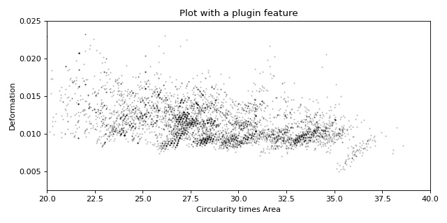
Working with plugin features
This example shows how to load a user-defined plugin feature recipe in dclab and use it in a scatter plot.
Please also download the plugin_example.py file for this example.
 1import pathlib
 2
 3import matplotlib.pyplot as plt
 4
 5import dclab
 6
 7
 8plugin_path = pathlib.Path(__file__).parent
 9
10# load a single plugin feature
11dclab.load_plugin_feature(plugin_path / "plugin_example.py")
12
13# load some data from DCOR
14ds = dclab.new_dataset("fb719fb2-bd9f-817a-7d70-f4002af916f0")
15
16# access the features
17circ_per_area = ds["circ_per_area"]
18circ_times_area = ds["circ_times_area"]
19
20# create a plot with a plugin feature
21plt.figure(figsize=(8, 4))
22xlabel = dclab.dfn.get_feature_label("circ_times_area")
23ylabel = dclab.dfn.get_feature_label("deform")
24
25ax1 = plt.subplot(title="Plot with a plugin feature")
26ax1.plot(ds["circ_times_area"], ds["deform"],
27         "o", color="k", alpha=.2, ms=1)
28ax1.set_xlabel(xlabel)
29ax1.set_ylabel(ylabel)
30ax1.set_xlim(20, 40)
31ax1.set_ylim(0.0025, 0.025)
32
33plt.tight_layout()
34plt.show()