Data processing
Visualization
For data visualization, dclab comes with predefined
kernel density estimators (KDEs) and
an event downsampling module.
The functionalities of both modules are made available directly via the
RTDCBase class.
KDE scatter plot
The KDE of the events in a 2D scatter plot can be used to
colorize events according to event density using the
RTDCBase.get_kde_scatter
function.
import matplotlib.pylab as plt
import dclab
ds = dclab.new_dataset("data/example.rtdc")
kde = ds.get_kde_scatter(xax="area_um", yax="deform")

ax = plt.subplot(111, title="scatter plot with {} events".format(len(kde)))
sc = ax.scatter(ds["area_um"], ds["deform"], c=kde, marker=".")
ax.set_xlabel(dclab.dfn.feature_name2label["area_um"])
ax.set_ylabel(dclab.dfn.feature_name2label["deform"])
ax.set_xlim(0, 150)
ax.set_ylim(0.01, 0.12)
plt.colorbar(sc, label="kernel density estimate [a.u]")
plt.show()
(Source code, png, hires.png, pdf)

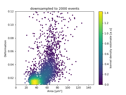
KDE scatter plot with event-density-based downsampling
To reduce the complexity of the plot (e.g. when exporting to scalable vector graphics (.svg)), the plotted events can be downsampled by removing events from high-event-density regions. The number of events plotted is reduced but the resulting visualization is almost indistinguishable from the one above.
import matplotlib.pylab as plt
import dclab
ds = dclab.new_dataset("data/example.rtdc")
xsamp, ysamp = ds.get_downsampled_scatter(xax="area_um", yax="deform", downsample=2000)
kde = ds.get_kde_scatter(xax="area_um", yax="deform", positions=(xsamp, ysamp))

ax = plt.subplot(111, title="downsampled to {} events".format(len(kde)))
sc = ax.scatter(xsamp, ysamp, c=kde, marker=".")
ax.set_xlabel(dclab.dfn.feature_name2label["area_um"])
ax.set_ylabel(dclab.dfn.feature_name2label["deform"])
ax.set_xlim(0, 150)
ax.set_ylim(0.01, 0.12)
plt.colorbar(sc, label="kernel density estimate [a.u]")
plt.show()
(Source code, png, hires.png, pdf)

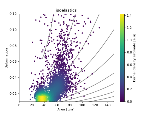
Isoelasticity lines
In addition, dclab comes with predefined isoelasticity lines that are commonly used to identify events with similar elastic moduli. Isoelasticity lines are available via the isoelastics module.
import matplotlib.pylab as plt
import dclab
ds = dclab.new_dataset("data/example.rtdc")
kde = ds.get_kde_scatter(xax="area_um", yax="deform")

isodef = dclab.isoelastics.get_default()
iso = isodef.get_with_rtdcbase(method="numerical",
                               col1="area_um",
                               col2="deform",
                               dataset=ds)

ax = plt.subplot(111, title="isoelastics")
for ss in iso:
    ax.plot(ss[:, 0], ss[:, 1], color="gray", zorder=1)
sc = ax.scatter(ds["area_um"], ds["deform"], c=kde, marker=".", zorder=2)
ax.set_xlabel(dclab.dfn.feature_name2label["area_um"])
ax.set_ylabel(dclab.dfn.feature_name2label["deform"])
ax.set_xlim(0, 150)
ax.set_ylim(0.01, 0.12)
plt.colorbar(sc, label="kernel density estimate [a.u]")
plt.show()
(Source code, png, hires.png, pdf)

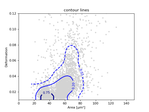
Contour plot
Contour plots are commonly used to compare the kernel density
between measurements. Kernel density estimates (on a grid) for contour
plots can be computed with the function
RTDCBase.get_kde_contour.
import matplotlib.pylab as plt
import dclab
ds = dclab.new_dataset("data/example.rtdc")
X, Y, Z = ds.get_kde_contour(xax="area_um", yax="deform")
Z /= Z.max()

ax = plt.subplot(111, title="contour lines")
sc = ax.scatter(ds["area_um"], ds["deform"], c="lightgray", marker=".", zorder=1)
cn = ax.contour(X, Y, Z,
                levels=[.03, .2, .75],
                linestyles=["--", "-", "-"],
                colors=["blue", "blue", "darkblue"],
                linewidths=[2, 2, 3],
                zorder=2)

ax.set_xlabel(dclab.dfn.feature_name2label["area_um"])
ax.set_ylabel(dclab.dfn.feature_name2label["deform"])
ax.set_xlim(0, 150)
ax.set_ylim(0.01, 0.12)
plt.clabel(cn, fmt="%.2f")
plt.show()
(Source code, png, hires.png, pdf)
Statistics
The statistics module comes with a predefined set of methods to compute simple feature statistics.
In [1]: import dclab

In [2]: ds = dclab.new_dataset("data/example.rtdc")

In [3]: stats = dclab.statistics.get_statistics(ds,
   ...:                                         features=["deform", "aspect"],
   ...:                                         methods=["Mode", "Mean", "SD"])
   ...:

In [4]: dict(zip(*stats))
Out[4]:
{'Mean Aspect ratio of bounding box': 1.2719607,
 'Mean Deformation': 0.0287258,
 'Mode Aspect ratio of bounding box': 1.1091422,
 'Mode Deformation': 0.016635261,
 'SD Aspect ratio of bounding box': 0.25233853,
 'SD Deformation': 0.028740086}
Note that the statistics take into account the applied filters:
In [5]: ds.config["filtering"]["deform max"] = .1

In [6]: ds.apply_filter()

In [7]: stats2 = dclab.statistics.get_statistics(ds,
   ...:                                          features=["deform", "aspect"],
   ...:                                          methods=["Mode", "Mean", "SD"])
   ...:

In [8]: dict(zip(*stats2))
Out[8]:
{'Mean Aspect ratio of bounding box': 1.2407207,
 'Mean Deformation': 0.02476519,
 'Mode Aspect ratio of bounding box': 1.1232222,
 'Mode Deformation': 0.017006295,
 'SD Aspect ratio of bounding box': 0.15993708,
 'SD Deformation': 0.015638638}
These are the available statistics methods:
In [9]: dclab.statistics.Statistics.available_methods.keys()
Out[9]: dict_keys(['Median', 'Flow rate', 'Mode', 'Mean', 'SD', '%-gated', 'Events'])
Export
The RTDCBase class has the attribute
RTDCBase.export
which allows to export event data to several data file formats. See
export for more information.
In [10]: ds.export.tsv(path="export_example.tsv",
   ....:               features=["area_um", "deform"],
   ....:               filtered=True,
   ....:               override=True)
   ....:

In [11]: ds.export.hdf5(path="export_example.rtdc",
   ....:                features=["area_um", "aspect", "deform"],
   ....:                filtered=True,
   ....:                override=True)
   ....:
Note that data exported as HDF5 files can be loaded with dclab (reproducing the previously computed statistics - without filters).
In [12]: ds2 = dclab.new_dataset("export_example.rtdc")

In [13]: ds2["deform"].mean()
Out[13]: 0.02476519
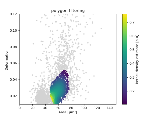
ShapeOut
Keep in mind that you can combine your dclab analysis pipeline with ShapeOut. For instance, you can create and export polygon filters in ShapeOut and then import them in dclab.
import matplotlib.pylab as plt
import dclab
ds = dclab.new_dataset("data/example.rtdc")
kde = ds.get_kde_scatter(xax="area_um", yax="deform")
# load and apply polygon filter from file
pf = dclab.PolygonFilter(filename="data/example.poly")
ds.polygon_filter_add(pf)
ds.apply_filter()
# valid events
val = ds.filter.all

ax = plt.subplot(111, title="polygon filtering")
ax.scatter(ds["area_um"][~val], ds["deform"][~val], c="lightgray", marker=".")
sc = ax.scatter(ds["area_um"][val], ds["deform"][val], c=kde[val], marker=".")
ax.set_xlabel(dclab.dfn.feature_name2label["area_um"])
ax.set_ylabel(dclab.dfn.feature_name2label["deform"])
ax.set_xlim(0, 150)
ax.set_ylim(0.01, 0.12)
plt.colorbar(sc, label="kernel density estimate [a.u]")
plt.show()
(Source code, png, hires.png, pdf)
