Scatter plots
For data visualization, dclab comes with predefined
kernel density estimators (KDEs) and
an event downsampling module.
The functionalities of both modules are made available directly via the
dclab.kde.KernelDensityEstimator class.
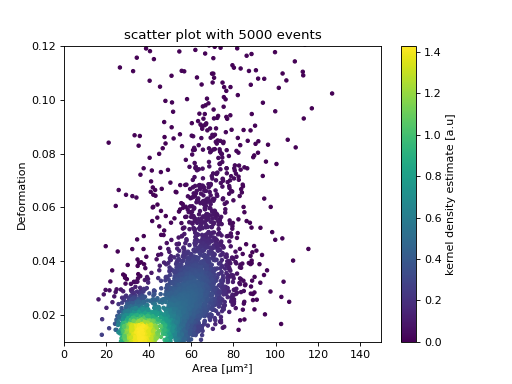
KDE scatter plot
The KDE of the events in a 2D scatter plot can be used to
colorize events according to event density using the
get_scatter()
function.
import matplotlib.pylab as plt
import dclab
from dclab.kde import KernelDensityEstimator
# load the example dataset
ds = dclab.new_dataset("data/example.rtdc")
# create a kernel density estimator
kde_instance = KernelDensityEstimator(ds)
kde = kde_instance.get_scatter(xax="area_um", yax="deform")

ax = plt.subplot(111, title="scatter plot with {} events".format(len(kde)))
sc = ax.scatter(ds["area_um"], ds["deform"], c=kde, marker=".")
ax.set_xlabel(dclab.dfn.get_feature_label("area_um"))
ax.set_ylabel(dclab.dfn.get_feature_label("deform"))
ax.set_xlim(0, 150)
ax.set_ylim(0.01, 0.12)
plt.colorbar(sc, label="kernel density estimate [a.u]")
plt.show()
(Source code, png, hires.png, pdf)

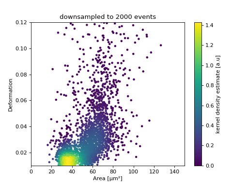
KDE scatter plot with event-density-based downsampling
To reduce the complexity of the plot (e.g. when exporting to scalable vector graphics (.svg)), the plotted events can be downsampled by removing events from high-event-density regions. The number of events plotted is reduced but the resulting visualization is almost indistinguishable from the one above.
import matplotlib.pylab as plt
import dclab
ds = dclab.new_dataset("data/example.rtdc")
xsamp, ysamp = ds.get_downsampled_scatter(xax="area_um", yax="deform", downsample=2000)
kde = ds.get_kde_scatter(xax="area_um", yax="deform", positions=(xsamp, ysamp))

ax = plt.subplot(111, title="downsampled to {} events".format(len(kde)))
sc = ax.scatter(xsamp, ysamp, c=kde, marker=".")
ax.set_xlabel(dclab.dfn.get_feature_label("area_um"))
ax.set_ylabel(dclab.dfn.get_feature_label("deform"))
ax.set_xlim(0, 150)
ax.set_ylim(0.01, 0.12)
plt.colorbar(sc, label="kernel density estimate [a.u]")
plt.show()
(Source code, png, hires.png, pdf)

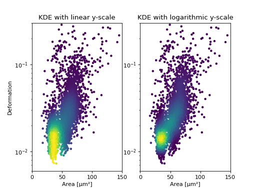
KDE estimate on a log-scale
Frequently, data is visualized on logarithmic scales. If the KDE
is computed on a linear scale, then the result will look unaesthetic
when plotted on a logarithmic scale. Therefore, the methods
get_downsampled_scatter,
get_raster(), and
get_scatter()
offer the keyword arguments xscale and yscale which can be set to
“log” for prettier plots.
import matplotlib.pylab as plt
import dclab
from dclab.kde import KernelDensityEstimator
# load the example dataset
ds = dclab.new_dataset("data/example.rtdc")
# create a kernel density estimator
kde_instance = KernelDensityEstimator(ds)
kde_lin = kde_instance.get_scatter(xax="area_um", yax="deform", yscale="linear")
kde_log = kde_instance.get_scatter(xax="area_um", yax="deform", yscale="log")

ax1 = plt.subplot(121, title="KDE with linear y-scale")
sc1 = ax1.scatter(ds["area_um"], ds["deform"], c=kde_lin, marker=".")

ax2 = plt.subplot(122, title="KDE with logarithmic y-scale")
sc2 = ax2.scatter(ds["area_um"], ds["deform"], c=kde_log, marker=".")

ax1.set_ylabel(dclab.dfn.get_feature_label("deform"))
for ax in [ax1, ax2]:
    ax.set_xlabel(dclab.dfn.get_feature_label("area_um"))
    ax.set_xlim(0, 150)
    ax.set_ylim(6e-3, 3e-1)
    ax.set_yscale("log")

plt.show()
(Source code, png, hires.png, pdf)

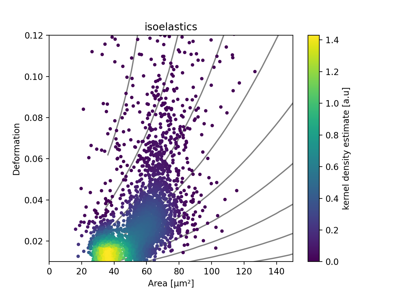
Isoelasticity lines
In addition, dclab comes with predefined isoelasticity lines that are commonly used to identify events with similar elastic moduli. Isoelasticity lines are available via the isoelastics module.
import matplotlib.pylab as plt
import dclab
from dclab.kde import KernelDensityEstimator
# load the example dataset
ds = dclab.new_dataset("data/example.rtdc")
kde_instance = KernelDensityEstimator(ds)
kde = kde_instance.get_scatter(xax="area_um", yax="deform")

isodef = dclab.isoelastics.get_default()
iso = isodef.get_with_rtdcbase(method="numerical",
                               col1="area_um",
                               col2="deform",
                               dataset=ds)

ax = plt.subplot(111, title="isoelastics")
for ss in iso:
    ax.plot(ss[:, 0], ss[:, 1], color="gray", zorder=1)
sc = ax.scatter(ds["area_um"], ds["deform"], c=kde, marker=".", zorder=2)
ax.set_xlabel(dclab.dfn.get_feature_label("area_um"))
ax.set_ylabel(dclab.dfn.get_feature_label("deform"))
ax.set_xlim(0, 150)
ax.set_ylim(0.01, 0.12)
plt.colorbar(sc, label="kernel density estimate [a.u]")
plt.show()
(Source code, png, hires.png, pdf)

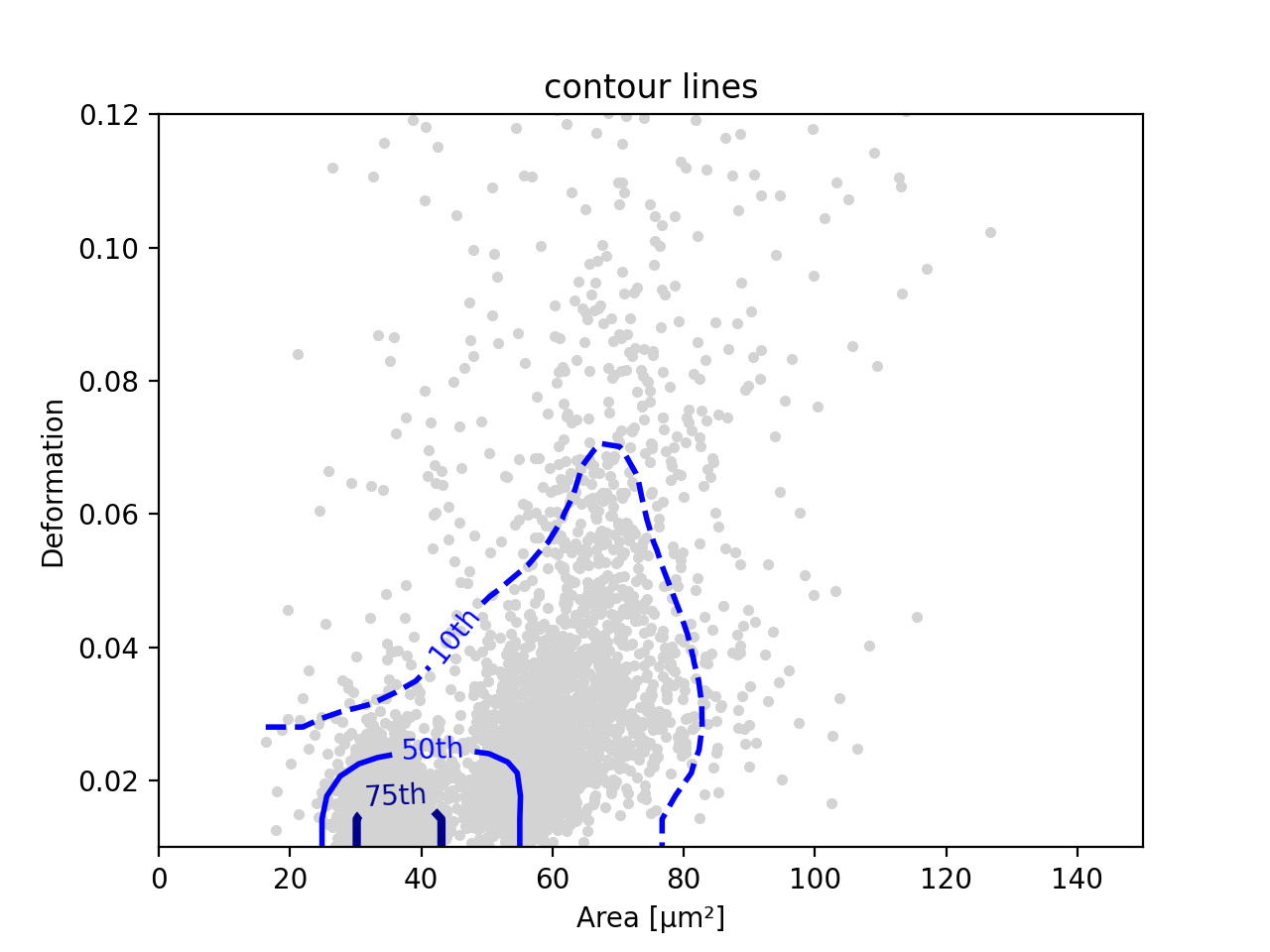
Contour plot with percentiles
Contour plots are commonly used to compare the kernel density
between measurements. Kernel density estimates (on a grid) for contour
plots can be computed with the function
get_raster().
In addition, it is possible to compute contours at data
percentiles
using get_contour_lines().
import matplotlib.pylab as plt
import dclab
from dclab.kde import KernelDensityEstimator
# load the example dataset
ds = dclab.new_dataset("data/example.rtdc")
kde_instance = KernelDensityEstimator(ds)

quantiles = [.1, .5, .75]

contours, levels = kde_instance.get_contour_lines(quantiles=quantiles,
                                                  xax="area_um",
                                                  yax="deform",
                                                  ret_levels=True,)

linestyles = ["--", "--", "-"]
colors = ["b", "r", "g"]

ax = plt.subplot(111, title="contour lines")
sc = ax.scatter(ds["area_um"], ds["deform"], c="lightgray", marker=".", zorder=1)

for i, (cnt, lvl) in enumerate(zip(contours, levels)):
    for c in cnt:
        ax.plot(c[:, 0], c[:, 1],
            linestyle=linestyles[i],
            color=colors[i],
            linewidth=2,
            label=f"{quantiles[i]*100:.0f}th quantile")

ax.set_xlabel(dclab.dfn.get_feature_label("area_um"))
ax.set_ylabel(dclab.dfn.get_feature_label("deform"))
ax.set_xlim(0, 150)
ax.set_ylim(0.01, 0.12)
ax.legend()
plt.show()
(Source code, png, hires.png, pdf)

Note
The lower-level method for computing contours from a given density level
is find_contours_level().
The lower-level method for finding a contour spacing that yields smooth
contours is find_smooth_contour_spacing().
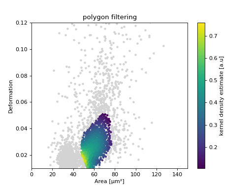
Polygon filters / DCscope
Keep in mind that you can combine your dclab analysis pipeline with DCscope. For instance, you can create and export polygon filters in DCscope and then import them in dclab.
import matplotlib.pylab as plt
import dclab
from dclab.kde import KernelDensityEstimator
# load the example dataset
ds = dclab.new_dataset("data/example.rtdc")
kde_instance = KernelDensityEstimator(ds)
kde = kde_instance.get_scatter(xax="area_um", yax="deform")

# load and apply polygon filter from file
pf = dclab.PolygonFilter(filename="data/example.poly")
ds.polygon_filter_add(pf)
ds.apply_filter()
# valid events
val = ds.filter.all

ax = plt.subplot(111, title="polygon filtering")
ax.scatter(ds["area_um"][~val], ds["deform"][~val], c="lightgray", marker=".")
sc = ax.scatter(ds["area_um"][val], ds["deform"][val], c=kde[val], marker=".")
ax.set_xlabel(dclab.dfn.get_feature_label("area_um"))
ax.set_ylabel(dclab.dfn.get_feature_label("deform"))
ax.set_xlim(0, 150)
ax.set_ylim(0.01, 0.12)
plt.colorbar(sc, label="kernel density estimate [a.u]")
plt.show()
(Source code, png, hires.png, pdf)